


| Effective communication lies at the heart of modern healthcare. Healthcare explainer videos and healthcare animation videos are powerful tools that simplify complex medical topics and enhance healthcare marketing videos across hospitals, pharma, and device brands. From pharma explainer videos to medical device explainer videos, this post showcases top examples of medical explainer videos—proof that video animation for healthcare can elevate understanding and drive engagement. |
The healthcare industry is a $12 trillion market. Yes, you read that right—it’s “trillion” with a “T.” This is what makes it one of the most lucrative industries for B2Bs to operate in.
However, as much as it’s lucrative, it’s also highly competitive, where gaining the trust of healthcare institutions and medical professionals is a constant uphill battle.
This got me thinking: How do some healthcare brands become favorite choices while others are left in the wind?
In this blog, I’ll take a closer look at how healthcare B2Bs position their authority using animated healthcare explainer videos. We’ll explore what they are, why they’re important, and examine 15 powerful examples of medical animated videos.
Healthcare animation videos are powerful tools across the medical industry—whether you're educating patients, promoting devices, or training professionals. Here are some high-impact use cases:
Explaining treatments or conditions to patients can be overwhelming. Medical animation videos simplify complex topics, using visual metaphors and clear narration to improve understanding and reduce anxiety. Patient animation content also boosts compliance and decision-making.
Much like a nursing concept map template helps organize complex medical information visually, animated explainer videos are a great educational medium for educating patients and medical professionals about your products and services.
Build trust and credibility in the process and make it easier to communicate value propositions as well.
Launching a new product? A medical device animation demonstrates your product’s functionality with clarity and appeal. These animations make product features tangible, especially for sales presentations, websites, and investor decks.
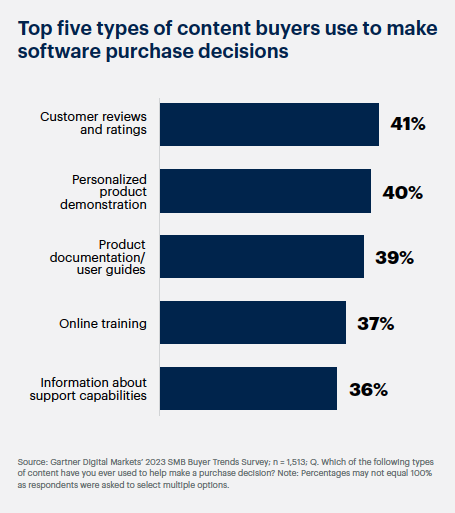
In fact, a study by Gartner found that personalized product demo videos are among the most preferred ways to influence purchase decisions.
Personalized product demonstrations are highly preferred in purchase decisions (Source: Gartner)
Though these findings mostly pertain to B2B SaaS video marketing, we can safely extrapolate these findings to medical animation.
Coming back to our discussion, here is a great example of a medical device animation video from Thermo Fisher.
The video covers the ID Nimbus Presto system, a collaborative development between Thermo Fisher Scientific and Hamilton for automated forensic sample extraction and purification. It highlights the products' features, benefits, and proper usage from a user’s perspective.
For healthcare brands, product demonstration videos are vital for convincing potential buyers of the efficacy and safety of their medical products.
Aiding in the decision-making process of medical professionals and procurement teams.
These healthcare marketing videos also help establish the brand as a credible authority that other healthcare consumers can rely on.
Hospitals, universities, and training institutes use 3D medical animation to visually walk through complex procedures, minimizing the need for cadavers or physical demos. This builds confidence among practitioners and trainees.
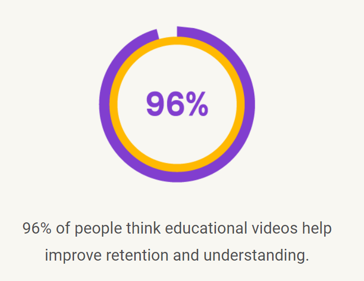
Our latest video marketing survey found that 96% of people find animated educational videos useful in increasing retention and understanding.
Videos are a great tool for boosting retention and understanding (Source: B2W’s Video Marketing Survey 2024)
And when you shift your focus to medical animation, this finding holds even more significance.
But in this scenario, educational videos become training videos or tutorial videos.
Such health animation videos are an amazing medium to:
These healthcare explainer videos provide step-by-step guidance to ensure thorough understanding and proper implementation.
The video below helped BD educate new medical professionals on the correct usage of urinary catheters and turn their message into an educational source that can be referred to multiple times during medical training.
B2B healthcare brands that use medical animation in their training content build a more coherent dialogue with their audience.
It can either be a discourse on a self-medication procedure for patients. Or it can be a visual guide for medical professionals on how to use their medical products and services. Either way, such videos:
You get the point.
Healthcare animation helps train staff efficiently—breaking down SOPs, emergency protocols, or product handling instructions into engaging animated sequences.
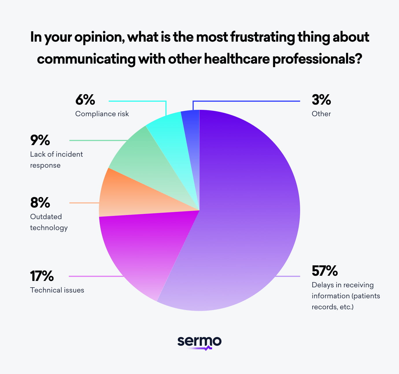
In a survey on the importance of effective communication in healthcare, Sermo found something interesting. They saw 57% of medical professionals finding delays in receiving information, the most frustrating part about healthcare communication.
Information delay is a big hurdle in healthcare communication (Source: Sermo)
As a B2B brand in healthcare, it’s easy to look at this from a corporate perspective. But I want you to look at these numbers from the eyes of a medical professional.
Delays and miscommunications can lead to a grave medical mistake that may not be overturned.
Ultimately, this puts patient care at risk, and no medical professional would want to find themselves in such a situation.
This is what makes healthcare communication one of the most important aspects of medical care.
Medical animation in the form of internal communication videos can help you out here. Here is a great example of animated video series from Grifols:
They help establish clear and scientific communications in healthcare organizations, be it among patients or employees within the B2B healthcare brand.
These can include updates on new protocols, an overview of company policies, or announcements of organizational changes.
For B2B healthcare brands, this ensures that all medical personnel are aligned with the company's goals, procedures, and values.
Leading to improved efficiency and a stronger organizational culture.
In the pharmaceutical and biotech industries, innovation happens at a molecular level—and that’s often difficult to explain through static visuals or lengthy documents. This is where medical animation becomes a game-changer.
From illustrating drug mechanisms of action (MoA) to showing complex molecule interactions, medicine animation simplifies the science and turns it into a compelling story. These medical animation videos help translate dense clinical data into visually engaging narratives that are easy for both specialists and non-specialists to grasp.
Whether you're presenting to investors, educating healthcare professionals, or launching a new therapy to the market, 3D medical animation lets you demonstrate how your product works inside the body—at the cellular or molecular level—without overwhelming your audience.
This makes medical animation services an essential asset for pharma marketers, medical affairs teams, and biotech startups looking to raise awareness, secure funding, or build trust with stakeholders. In an industry where accuracy and clarity are everything, healthcare animation helps you deliver both—beautifully.
Healthcare brands use explainer videos to simplify healthcare offerings while clearly communicating how they can be used in medical scenarios. The videos become a tool for building trust and establishing authority.
After going through the healthcare animation videos listed below, you'll better understand the effectiveness and charisma of these videos.
Hospitals lose millions each year due to misplaced or untracked medical supplies. The University of California, Irvine (UCI) needed to raise awareness among its staff about this costly issue — but traditional presentations and reports weren’t making an impact.
They turned to our healthcare video marketing team for a creative, story-driven solution that could communicate the issue clearly, inspire accountability, and motivate real behavioral change.
In a busy hospital setting, long memos and repetitive training materials rarely hold attention. UCI’s supply chain management team needed an engaging healthcare video production approach that could quickly explain the problem, illustrate its financial and operational impact, and drive action among staff.
Our team developed a short, animated healthcare video that used humor, empathy, and storytelling to highlight how supply mismanagement affects patient care and hospital efficiency.
The animation combined 2D motion graphics with light character design, making the message relatable and easy to understand. The healthcare video marketing strategy focused on visual clarity and emotional tone — helping UCI turn a logistical challenge into a story that resonated across all departments.
The animated video became a powerful internal training tool used in staff meetings and onboarding programs. It helped:
By transforming a technical problem into a relatable visual message, UCI achieved measurable improvement in awareness and operational efficiency.
If your organization faces a similar challenge, our videos can help you educate, engage, and empower your audience.
Noni by New Age, a global wellness and nutrition brand, wanted to educate audiences about their new health supplement line. Traditional product demos were expensive, time-consuming, and lacked emotional appeal.
Our team created a motion-character–driven animated product demo video combining 2D animation, kinetic typography, and lifestyle-inspired design.
This approach transformed a straightforward product walkthrough into a visual story of transformation and well-being — illustrating benefits, ingredients, and outcomes with clarity and emotion.
Through thoughtful medical video production, we captured the balance between scientific credibility and relatable storytelling, ensuring the product felt both aspirational and trustworthy.
These results proved that visual storytelling through healthcare explainer videos is not just creative—it’s commercially effective.
By making the science behind wellness accessible and emotionally driven, Noni by New Age turned product education into an experience that customers remembered — and acted on.
Walgreens, one of the world’s leading pharmacy and healthcare chains, wanted to educate its audience on the importance of blood sugar awareness and lifestyle management. The challenge was communicating essential health information in a way that was both easy to understand and emotionally engaging.
Most people find medical content intimidating or overly technical. Walgreens needed a format that could simplify complex topics like glucose levels, insulin balance, and healthy habits — while keeping it visually appealing and relatable for a general audience.
The video had to do more than explain — it had to connect, motivate, and encourage viewers to take small but meaningful steps toward healthier living.
Our team created a character-based health animation that used vibrant colors, expressive motion, and friendly narration to guide viewers through the concept of blood sugar regulation.
As a trusted provider of medical animation examples, we combined storytelling and design precision to make scientific information feel personal. The video followed a relatable character on their wellness journey, showing how daily choices — like diet, exercise, and medication — influence blood sugar levels.
By integrating 2D character animation with simple infographics and a warm tone, the animation balanced education with emotion — transforming complex medical data into clear, actionable insight.
The animation quickly became a valuable asset in Walgreens’ wellness education campaigns. It:
By turning education into experience, the medical animation achieved more than awareness — it sparked empowerment.
When science is explained through empathy and design, health information becomes accessible, memorable, and actionable — helping brands like Walgreens build trust and drive healthier communities.
Edwards Lifesciences, a global leader in patient monitoring and cardiac care technology, wanted to demonstrate the functionality of its advanced fluid management system. The challenge? Conveying intricate mechanical and physiological processes in a way that was clear, credible, and visually engaging.
Fluid management systems are highly technical — involving dynamic flow, pressure regulation, and real-time data feedback. Traditional presentations or diagrams couldn’t illustrate how each component interacts within the human body.
Edwards needed a visually immersive solution that could:
Our creative team used 3D medical device animation to demonstrate how the system monitors and adjusts fluid levels in critical care scenarios.
Through cinematic healthcare video production, we showcased the product in action — integrating anatomical accuracy, product modeling, and fluid simulation to visualize every detail of its operation.
The animation used clean transitions, branded colors, and controlled camera movement to emphasize usability, accuracy, and clinical importance. A measured voiceover guided viewers through the process, balancing technical depth with storytelling clarity.
By merging engineering precision with creative visuals, the medical device animation turned a complex concept into an intuitive, memorable narrative.
The final video became a cornerstone of Edwards’ marketing and training ecosystem. It:
The animation’s blend of realism and clarity helped position the product not just as a device, but as a life-saving tool backed by intelligent design.
By combining scientific accuracy with engaging design, healthcare brands like Edwards can communicate innovation more effectively — helping professionals learn faster, sell smarter, and care better.
At the height of the pandemic, healthcare communication had to be clear, credible, and compassionate. The University of California, Irvine (UCI) wanted to educate staff and the public about proper mask usage and efficacy through visuals that felt both scientific and reassuring.
UCI needed to simplify technical details about filtration, virus transmission, and mask performance for a broad audience. Traditional infographics and manuals lacked engagement and emotional resonance.
The solution required scientific precision, visual simplicity, and empathetic tone—elements best delivered through high-quality healthcare video production.
Our creative team designed a whiteboard animation that combined clean line art, fluid motion, and a conversational voiceover to show how UCI’s BluMask technology provides reliable protection.
Every frame—created through expert animation for medical products—balanced medical accuracy with human warmth. The production process involved close collaboration with UCI’s healthcare professionals to ensure visual and scientific integrity.
The animation became one of UCI’s most effective awareness tools, achieving:
By merging empathy, clarity, and medical precision, UCI educated and inspired its audience—proving that visual communication saves more than attention; it saves lives.
Santen, a global leader in ophthalmology, wanted to explain tear film instability—a key factor in dry eye disease—to both healthcare professionals and patients. The challenge was transforming dense medical data into engaging, easy-to-understand visuals.
Using precise, hand-drawn whiteboard animation and clear narration, our medical video production experts turned complex ophthalmic concepts into a visual journey. Every frame explained how tear film works and why its stability matters, using warm, accessible design to ensure empathy and clarity.
The healthcare animation video balanced professionalism with simplicity—helping audiences learn without feeling overwhelmed.
The animated video became an essential education tool across Santen’s global communication channels. It:
This case demonstrates how healthcare animation videos can make complex science approachable, empathetic, and actionable—helping healthcare brands educate, inspire, and connect with audiences worldwide.
Disc herniation is more common than you might think. A study from Physiopedia found that a herniated disc affects 5 to 20 adults per 1000 adults every year.
But awareness and understanding are often limited, which creates a gap in both patient education and professional training.
This is where healthcare animation videos become invaluable. When SpineCal Orthopedic Institute partnered with us, their goal was simple yet powerful: create a clear, engaging explanation of disc herniation that educates patients and equips medical professionals alike.
Through our 3D medical animation services, we developed a high-quality explainer video that not only illustrated what disc herniation is and its causes but also walked viewers through the surgical procedure to treat it.
What makes this video stand out is how it transforms complex medical details into a story-like journey. Instead of overwhelming viewers with jargon, the animation breaks down every technical step in a way that feels accessible, memorable, and trustworthy.
This project proves how medical animation company can bridge the gap between doctors and patients—making even the most intricate surgical procedures easy to understand, while reinforcing SpineCal’s credibility as a trusted orthopedic institute.
Here's a fun little medical trivia to get the ball rolling.
According to the American College of Rheumatology, around 790,000 knee replacement surgeries are performed in the US every year.
Knee replacement surgery may be one of the most common procedures in modern medicine.
But here’s the truth: common doesn’t mean simple. For many patients, families, and even young professionals in the medical field, the process still feels like a mystery.
This is where medical animation videos become powerful. Take this 2D medical animation from Bupa Health—instead of overwhelming viewers with jargon, it paints a clear, step-by-step journey through the knee replacement procedure. It shows not just how the surgery is done, but also the conditions needed for success, all in a way that feels both educational and reassuring.
What truly sets it apart is its empathy. The video never talks down to its audience. Instead, it connects—with patients who are anxious, with curious learners who want clarity, and with professionals who value accuracy.
That’s the essence of great medical animation services: they transform complex medical knowledge into stories people can understand, remember, and trust. And that’s what makes this example one of the most inspiring medical animations on the list.
They say: Prevention is better than cure.
But prevention requires awareness.
And when it comes to medical conditions, the importance of awareness can't be stressed enough.
So when Health Monitor Network (HMN) reached out to us for a video, they weren't looking to just make another healthcare explainer video on Chronic Obstructive Pulmonary Disease (COPD).
They wanted to tell the story of COPD from a patient’s perspective.
Through medical animation videos, we visualized the disease’s progression inside the body while also highlighting preventive steps. The combination of character animation and accurate medical visuals made the message approachable—helping patients understand symptoms without feeling overwhelmed and giving healthcare professionals an engaging tool for education.
By blending storytelling with medical accuracy, our medical animation company helped HMN deliver awareness with empathy, making their video not only informative but also impactful.
Astellas Pharma, a global pharmaceutical leader, wanted to communicate the importance of data integrity and management within its healthcare ecosystem. The goal wasn’t just to explain how data supports drug development and patient outcomes — but to make it relatable for employees and stakeholders who aren’t data specialists.
Data is at the heart of innovation in healthcare, yet it’s often perceived as abstract or technical. Astellas faced the challenge of helping internal teams understand the human impact of accurate data management — how clean, reliable data ultimately leads to better treatments and patient care.
The message needed to educate, inspire, and emotionally connect with a non-technical audience while maintaining the professional standards expected from a global pharma brand.
Our creative team used medical animation and healthcare video production techniques to develop a story-driven explainer centered on relatable characters.
Through expressive motion design, symbolic visuals, and simplified metaphors, the video depicted data as a “journey” — showing how it flows through systems, empowers decisions, and ultimately benefits patients. Each scene connected the technical (data pipelines, compliance, security) to the emotional (patient outcomes, scientific collaboration).
The animation style blended 2D character animation with clean infographics, ensuring visual clarity while keeping the tone engaging and human. The result was a seamless fusion of science, storytelling, and empathy — bringing Astellas’s internal vision to life.
The video quickly became one of Astellas’s most effective internal communication tools. It helped:
By turning abstract information into a compelling narrative, the medical animation bridged the gap between technical operations and human purpose.
Through creative visuals and relatable storytelling, Astellas didn’t just educate its audience — it reminded them why accuracy and empathy go hand in hand in modern medicine.
When healthcare communication moves from numbers to narratives, understanding follows — and so does impact.
Fibrogen develops transformative medical therapies based on innovative science.
They aimed to explain the science behind Roxadustat, a novel and physiological approach to treating chronic kidney disease (CKD).
They wanted their medical animations to speak to nephrologists and nephrology healthcare professionals who treat patients with chronic kidney disease with or without dialysis.
They wanted these professionals to understand and be comfortable with the medical science behind Roxadustat, how it works, and its Mechanism of Action.
On the other hand, those looking into launching new corporations or business ventures in the healthcare sector, understanding the intricacies of such innovative treatments done by Fibrogen and their market potential is crucial.
So, our medical animation company used the power of storytelling and whiteboard animations to educate the audience, keeping the scientific details intact but simplified.
When you want to sell a medical device, the explanation about its working and offering can be technical and complex, making it hard for prospects to fully take the data in.
OrthAlign understood that and thus sought out our services to make this infographics animation video to introduce its Lantern—a device designed to provide the benefits of larger systems in a simple handheld navigation unit.
This medical device explainer video starts off by building the context before introducing the device. Using visuals of dynamic movements of circular balls in bright and dark backgrounds, the voiceover and explanatory text boxes highlight how surgeons are turning to robotics for accuracy and individualized alignment for their patients.
Next, using the 2.5D animation imagery of their device and text, the voiceover explains all the functions of Lantern—from how it’s used, to how it's easily integrable and scalable. With a zoom, the video further gives viewers details about the technology it works on.
The way this healthcare video production uses black and red text to highlight points about the device, and the minimalist screen elements—like when the device is on screen and we only see a few explanatory texts—makes sure the information doesn't become too cluttered to take in.
The anatomic animation of the knees and explanation of how the device helps with better alignment make sure viewers catch the points that make this device credible.
This video brilliantly simplifies a complex medical offering through thoughtful visual storytelling. From shadow effects that give the device a realistic 3D look to clear, explanatory voiceovers and on-screen text that breaks down intricate details, every element is designed for clarity. The use of contrasting backgrounds and color-coded text further enhances understanding—making the message not only accessible but engaging. It’s a great example of how healthcare marketing videos can turn complexity into confidence.
As a healthcare brand, your mission and how you convey it to people matters. That is why Inova chose to go with a simple 2D explainer video production to showcase how they deliver excellent care through patient education and research.
It combines engaging character animations with informative infographics—charts, graphs, and visuals that simplify a wide range of offerings. The voiceover highlights how Inova supports continuous learning through live conferences, online education, masterclasses, and expert panels. By integrating real-world examples and data-driven visuals, the video demonstrates how Inova has built its reputation as a leader in healthcare education and innovation. It’s a strong example of how healthcare animation videos can clearly convey value to both professionals and organizations.
The scene where the registration data visuals transform into a keyhole, followed by the voiceover saying that InovaHealth is the key to advancing people’s missions, and then the key goes through the hole leading to the CTA, is a standout.
All in all, the way the voiceover, along with easy-on-the-eye characters and the infographics on screen, makes such a massive volume of offerings and data so easy to absorb and understand within such a short time frame is commendable.
Start with a stat that is relevant to your target audience and they'll stay to watch. That is what Athena Health effectively did with this 2D infographic animation video. They represented a very hard-hitting reality in this video: that the time doctors can give their patients uninterrupted is shrinking, and it's all because of the intermediary steps or tasks that keep being pushed their way.
To showcase the weight of this situation, the video uses characters of doctors, roughly made up of shapes, going through these time-consuming tasks like all the scrolling, clicking, and box-checking. The way the clock keeps ticking at the bottom of the screen while the doctors are sweating through these tasks shows how the time they have to interact with their patients is shrinking.
Now, once the brand has effectively played into the problem, the voiceover discusses how Athena Health is trying to change that and how they've made it their mission to "Unbreak Healthcare" in America.
Transitions from leaves to graphs show how the brand is trying to get doctors paid faster and without any hassle. The 2D animation video then shows all the inefficiencies that doctors could be dealing with by displaying actors wrapped in phone calls, massively increasing paperwork, and then showing how the brand takes this work off their plate.
Showcasing infographics of how many doctors, till the present moment, have benefited from it and are able to pay more attention to their patients builds more credibility around the brand.
The connective diagrams of doctors to other providers and their patients show the immense amount of people and work the brand is trying to handle—and the keyword is "effectively."
The last scene, where a shredder shreds the distressed versions of the doctors away, highlights how Athena Health will solve—and at a certain level has already solved—this issue for so many doctors. Such powerful scenes make medical marketing videos worth remembering.
Behind every superhero is a side character silently supporting them in their mission. Someone who makes stopping the bad guys and saving lives a cakewalk. Using this very analogy and the charm of 3D character animations, Medhost positioned itself as that very important side character for doctors and hospitals.
Starting off the character animation video with a superhero saving the day, then smartly replacing the hero with a healthcare provider, then showcasing the busy, chaotic, and life-saving scenes inside such healthcare facilities, the brand says that as a medico, you might not be wearing that hero cape—but nonetheless, what you are doing is superheroic.
But to manage the paperwork, look after patients, and run those heavy machines, these heroes need that side character too. This is where the 3D animation video introduces Medhost. The way the hospital buildings each represent a letter of the word "Medhost," and while we are going through the visuals of the buildings, the voiceover explains how this healthcare brand supports hospitals, is quite appealing.
The way Medhost EHR connects to the facility, each task becomes so systematic, connected, and fast—now the room flowing with constantly flying papers looks well kept too, a feat!
This video animation for healthcare stands out with its high-quality character design, seamless dialogue delivery, dynamic camera transitions, and visually appealing gradient graphs. Every element works together to keep viewers engaged while clearly conveying Medhost’s role in supporting healthcare professionals.
Facing the blues of bad health when you’re busy can be tough, right?
It becomes especially more troublesome when you have to sync your benefits with your doctors and link in where it hurts with those who can help. The helplessness, frustration, and gloom of managing so many things on so many platforms can leave you feeling "blue"—literally—just as shown in the starting clip of this video from Crossover.
Using a 2.5D character animation style in this video, the brand played right into the emotions of its target audience and accurately encapsulated the feeling of a patient—their helplessness in managing health and a busy life, and their need for good healthcare.
The use of dark, gloomy blue tones at the start of the video, where the character of a busy woman is caught in the rain, develops a cold, and breaks her glasses—makes viewers feel bad for her but also relate to her.
Next, when the voiceover shifts from discussing these problems to the solution—Crossover—the gloom disappears. We see her character, now a little chirpier, moving through a bright and colorful world. The voiceover discusses how the brand sees healthcare: organized around people, not payments.
When the voiceover states that the brand brings all the experts and care into one place, the visuals on the screen show our character entering a facility of sorts after using the Crossover network. She passes by an optometrist, a general physician, and enters a room where she connects with a faraway expert via technology.
Then we see a smooth yet fast zoom-out shot from her discussion in the tech room to the world outside the building, where we see other characters. While the shot passes through the different characters, the voiceover further emphasizes how Crossover is building a system of health that connects you, your doctors, and your benefits in one simple place—and then the big Crossover logo enters the screen.
The way the logo, like a button, is switched on and all the blue fields below it turn colorful—like the start of the video—was a smart way of showing how Crossover makes a massive positive difference in people’s lives.
The use of characters that bring out the real pain of the target audience, the smart use of the logo, playing around with color, camera angles, and creating the illusion of 2D characters in 3D environments are all the elements that make this such a great medical explainer video.
The way healthcare companies and patients interact has changed due to cutting-edge health tech. Patients with chronic illness are demanding care and solutions that are more coordinated, customized, and convenient—they are more active now.
What this means for traditional healthcare providers like pharmaceutical companies is that they'll lose their customers if they don't reform themselves to meet these shifting demands and expectations. Deloitte, in this detailed mixed media animation video, zooms in on this very topic.
It asks the pivotal question, "How can pharmaceutical companies engage with patients?" at the very start and then goes on to explain that throughout the video.
The initial scene, where the voiceover is talking about current patients who are more active in terms of seeking their care and meds, shows the visuals of a live-action silhouette of a patient in the background, and we see visuals of meds, labs, and doctors superimposed on her figure. These simple visuals effectively sum up what today’s patients are seeking.
When the narrator talks about the history of pharmaceutical companies, we see live footage—a collage of different shots—of the production of machines, and then the products they are making actually roll out in 2D format on the screen. These engaging visuals keep the eyes on screen while the complex explanations play in the background.
This video brilliantly visualizes the evolving healthcare landscape. Graphs emerge dynamically from different corners of the screen, while icons representing real-world healthcare scenarios—like workouts, elderly care, health records, and ambulance transfers—fill the frame with context. These layered visuals give viewers a clear, engaging snapshot of the modern healthcare ecosystem, making complex insights easier to understand and retain. It’s a compelling example of how pharma explainer videos can turn data into impactful storytelling.
Not only this, but the subtle use of moving medicine bottles or colorful tablets, and the constant call or machine noises in the background, all go on to emphasize what this video is all about.
The way the video mixed and matched layered designs of live action, stop-frame, simple 2D animations, motion graphic animation, and infographics throughout the video to explain the normal way pharmaceutical companies used to run, and the new changes they have to adopt to stay at the top of their game, was amazing. It’s what makes it a standout among other pharma explainer videos.
You are working on the next great health app, an idea that can be groundbreaking, and then there's a hiccup—you need technical experts to build the app to be compliant, global, intelligent, and interoperable with the entire healthcare system.
As lengthy as the sentence above is, so is the process of getting all this "right." By understanding and showing this very pain point of the healthcare app builder community in this 2D animation video, Medable has its target audience's full attention. Once it has brought the issue in front of the people using those simple 2D characters and infographics, it can provide prospects the platform that can do this for them.
Talking about the specialty of the platform, the voiceover discusses how it has a set of adaptive modules that cover all the main aspects of a medical app like compliance, backend, analytics, collaboration, and research.
The way each of these aspects was represented using colorful cubes, and then the cubes combined to form a bigger cube to show how you'll get it all in one place to speed up product development.
Then the use of a dark background with gradient elements when the voiceover talks about how Medable takes care of all the HIPAA compliance for you, and then again the shift to a white background with minimalistic tone characters and elements, was quite an engaging visual transition.
In essence, this simple animated healthcare explainer video was able to impeccably convey how this brand can help you with your health app and then at the end nudged you to try it and begin developing for free.
Broke a bone? Go to a doctor. Eyes itchy? Go to another kind of doctor. Nose is blocked? Yes, you know it—go to another kind of doctor.
Does your physician see the whole of you or just the part they are treating?
That's the hard-hitting question that Summa Health starts this 2D character animation video with. Just like the visual of a disembodied nose, eye, hands, and fractured leg sitting on the sofa hits hard, so does this question. Visiting different physicians for different ailments and managing it all frustrates any patient.
Once the scene is built around this frustration, the scene from these body parts does a 180, and we are shifted to the world of solution. The visuals show how Summa Health provides you sum total care. Showcasing a scene where a doctor is analyzing a lot of health-related infographics on a big screen, the narrator further reinstates how Summa lets these providers get a complete picture of your health.
The video then shifts to scenes of healthcare professionals collaborating seamlessly—illustrating how Summa Health brings together specialists to deliver coordinated, patient-centered care. In the final moments, we see diverse medical professionals happily treating patients, reinforcing the brand’s message of comprehensive, compassionate healthcare. It’s a clear example of how effective healthcare marketing videos can humanize a brand while showcasing its real-world impact.
Using a minimalistic color palette, focusing more on the characters and the body parts, and the subtle use of medical infographics is what made this video so engaging to watch. This is also what makes it different from other medical animation examples.
We all know a person who has an opinion about everything. Taking their opinion on minor things like a barbecue might do—but health? No, no.
Using this hilarious yet relatable scenario, 2nd.MD starts this 2D healthcare animation video. It transitions from the funny scene of that one nosy person following our main character and preaching about cooking, using bug repellent spray, and using certain medicines for backache. But unwanted medical opinions are where our main character draws the line—he makes use of 2nd.MD.
The video then shows zoomed-in visuals of the phone, with steps he uses to connect with a board-certified specialist in-network who can help him with his backache. The voiceover goes on about the offerings of this app and how it can help users while the character navigates it.
The video doesn't just show the user-facing side of the app working but also shows how its care team works—collecting more information, selecting the experts, and scheduling the time of your consultation. You can also see the use of engaging infographics to show how the app provides you with a detailed summary after the consultation.
The use of vivid colors, minor infographics, minimalist characters, and the explanatory voiceover ties this video together and effectively helps highlight 2nd.MD's work and offerings to us viewers.
Good old-fashioned cooperation can even solve all your employee healthcare problems!
Starting off with a backdrop of dark space filled with glowing and colorful planets, the video discusses how humans have been able to reach space with one key thing: collaborating.
Now the scenes shift to a more whitish world, where we see a person trying to navigate a troublesome healthcare scenario. The unlisted healthcare brand in this video discusses how healthcare costs are increasing and how employee health continues to decline.
The scene where the voiceover states "decline" and the structure the character was standing on shatters—and he travels down with the debris and sees stats of healthcare dollars being wasted—was quite cinematic.
After this, we see interactions of the character with doctors, and the voiceover explains how this brand is changing the scenario; it is improving care and saving a lot of money for its customers.
To illustrate how the brand partners with doctors, employers, and providers to improve employee healthcare, the video shows a 2D character surrounded by expanding layers of supportive figures. This powerful visual metaphor captures how the brand fosters seamless collaboration across departments—turning fragmented care into a unified, people-first approach. It’s a standout moment that reflects the true potential of effective medical marketing videos.
All in all, it's a simple explainer video that uses the right bit of shock moments, drama, infographics, voiceover, and character expressions to bring its message forward. Being simple yet powerful with your graphics is one of the most effective healthcare social media marketing strategies you can use.
Use a simple analogy to relate the human body to your brand offerings and people will stop to watch. That is what Google did with this 2D animation explainer video, where you see the classic white background of Google videos with some pops of color as text.
Starting off with dynamic text and a picture of RBCs in the middle, the video narrates how blood cells are great collaborators and how they use this collaboration to keep the body healthy.
Then the video compares these blood cells to healthcare teams and how they need to move fast and work smart. Google quotes this need as the reason they created G Suite—the productivity solution for employees and caregivers.
When the voiceover is discussing this, the screen shows all the logos of apps that come under this G Suite. Now, one by one, using screencast animation, the brand shows how people can use different offerings of G Suite.
For example, the video demonstrates how healthcare teams can chat in real time, schedule trainings, use Sheets and Drive to securely manage data access, and collaborate on patient-facing content with Slides. Each feature is showcased with smooth screencast animations, reinforcing how G Suite streamlines communication and coordination. It’s a strong example of how medical explainer videos can turn everyday tools into essential healthcare solutions.
When you are an eye health and wellness brand trying to bring in more sign-ups, the best way to engage people is by using a video to inform them—not directly sell. That is what Eye Love did with this 3D animation video.
Using high-quality 3D graphics and a hilariously witty voiceover, the brand goes on to explain the ins and outs of chronic dry eyes.
Starting with an eye-shaped ball, it discusses how dry eyes can bug you, and visuals showing bugs sitting on that ball literally show the "bug" part—it was smart. Next, it uses different shapes and the fast-changing structure of clouds on command to show how people describe their symptoms differently.
Next, it shows what people actually describe this feeling as. For example, when it discusses how people describe it as a feeling of having sand in their eyes, we see a literal crab throw sand on a ball, or it uses a game setup to show how some people complain of it causing too many tears.
The video dives deep into explaining the structure and function of tears, as well as the role of artificial tears in treatment—delivering valuable education in a highly engaging format. Viewers walk away not just informed, but genuinely entertained. It’s a brilliant example of how medical animation videos can simplify complex topics without ever losing attention—your eyes (and mind) stay hooked throughout.
Just when the video starts to wrap up, the voiceover states how you need to seek experts to get rid of this issue, and then there appears text urging people to visit the brand's website and chat with an eye doctor. It was truly one of the best non-salesy animated healthcare commercials.
People are still quite skeptical about taking part in genetic testing, and as a healthcare brand, Color, which has a genetic testing model, wanted to change this attitude. They wanted people to know how this test can help them understand their risk of diseases like cancer and take better preventative care.
Using this simple mixed media animation video, Color started explaining the concept to people from the very basics—DNA, how it contains remarkable information that can help you understand if you are at risk of certain healthcare conditions like cancer or heart disease, and how it can help you plan better and take preventative measures.
Using bright colors, the still cutout pictures of body parts like hands and eyes, and the moving infographics like the DNA strand and graphs help people grasp the concept of the genetic information being discussed by the voiceover.
Some scenes, where the whole body cutouts are still except for a part of the body like the hands taking notes, make the video engaging. Some scenes are quite symbolic in the video too—like when the voiceover states that by learning about your genetic health risks, you are advancing scientific knowledge of the human gene.
The visuals show hand cutouts opening the cap of a test tube, and flowers blooming from inside the tube. This scene shows how gene testing technology is such a blessing for your health. The smart execution of visuals in this video is what makes it one of the best video animation for healthcare on this list.
Sometimes brands need to take up the role of a close one to make you feel comfortable enough to talk about a sensitive topic. That is what the Crohn's & Colitis Foundation did here with this mixed media animation video.
It uses the 2D characters of a small girl and an older college boy (maybe her cool older cousin), placed in a 3D background, to discuss the sensitive topic of growing older with IBD.
The way the older boy explains the concepts, the do's and don'ts, makes her comfortable sharing her issues with the doctor, talks about parties to keep her engaged, and guides her on what to do when she does see people—all makes it easier for people to relate and not be bored in the video.
The way the boy changes shapes throughout the video is funny too—like how he becomes a big inflated balloon, a tree, a hot air balloon—and the doctor makes you laugh at times.
The casual tone of the conversation between these two, the fun banter, like when the boy is talking to her about something and he’s in the form of a hot air balloon, and she makes the balloon flame go high and he starts sweating—the face he makes is hilarious.
The hospital scene, the 3D chat scenes, the party scenes, the conversations—are the shining stars of the video. The way it explains and entertains—that is what makes it a good animated healthcare marketing video.
The casualness of such B2C videos is what makes them stand out. For B2B, the strategies used are a bit different. To better understand the difference between B2B vs B2C healthcare marketing, you can check out our linked blog.
Healthcare institutions don't just treat people—they hold information, sensitive information about their health and finances. This information is like gold to cybercriminals, and thus cyberattacks on such institutions are quite common.
Living in fear of these unknown attacks is not the solution. Google discussed the solution in this mixed media animation video.
The blaring fonts and collage-like animations of hands opening a treasure box show how this patient data is so desirable to cybercriminals. Once the serious voiceover is done discussing these scary details about the vulnerabilities of our healthcare system, we enter the gradient world of solutions.
Using infographics and text, the narrator explains how, with the combined efforts of stakeholders from across healthcare, tech, and government, we can protect these critical assets.
While talking about the true visibility such collaboration provides, we see cutouts of eye pictures pasted on the screen—some eyes even showing movement.
The video uses certain motion graphics, paper cut–like animations, text, and infographics throughout to emphasize how our data is safe with Google. The last text, "Safer with Google," further reinstates that belief and trust people have in Google.
Apart from using explainer videos, there are other healthcare video marketing strategies you should know about to improve your conversion rate. So check out the linked blog to learn about these varied strategies.
Medical animation is used by a variety of professionals and organizations, such as researchers, surgeons, pharma companies, medical device manufacturers, universities, hospitals, and nonprofits.
These groups utilize animations to simplify complex medical topics, making them easier to understand for diverse audiences.
Usually, their target audiences are patients, healthcare providers, investors, and researchers.
To effectively deliver their message to these audiences, the groups use medical illustrations in their presentations, training, websites, virtual reality, social media, and marketing materials.
They use these animations because they’re especially useful for explaining difficult topics that can’t be easily conveyed with words or still images, like molecular processes or step-by-step procedures.
By visualizing these complex concepts, medical animations increase the accessibility and understanding of science and healthcare.
Here are the primary benefits your healthcare brand can reap after using such benefits of using such videos:
1. Streamlined Onboarding and Training
Explainer videos cut the fluff regarding the onboarding process for new healthcare technologies and services for healthcare institutions and medical professionals.
By visually demonstrating how healthcare products work and the specific medical problem they’re solving, these videos reduce the learning curve and training time for staff within healthcare organizations, ensuring they can utilize new tools more efficiently and effectively with reduced chances of life-threatening error.
2. Increased Engagement
In healthcare, engagement leads to comprehension. And comprehension ensures proper usage of medical products during critical medical processes or organizational operations.
That’s where dynamic and visually appealing, explainer videos bridge the gap between comprehension and engagement. They make presentations not only informative but also entertaining so as to be useful in B2B healthcare marketing.
3. Improved Conversion Rates
For B2Bs in any industry, from fintech to healthcare, conversion rates are an important metric that quantifies business growth. It shows that B2Bs aren’t just attracting more leads but also converting them into customers and driving revenue.
For healthcare, conversion rates have a more important meaning too. They show how you are helping healthcare organizations make a difference in the lives of patients.
When you use video animation for healthcare, you are effectively able to communicate the value proposition and operational intricacies of your solutions. This also leads to higher conversion rates in your healthcare marketing campaigns.
4. Enhanced SEO Value
5% of all Google searches are health-related. And with 16.4 billion searches conducted every day, just imagine the range of online visibility that healthcare marketing can unlock. And a big component that makes this possible is SEO.
That’s where explainer videos can unlock the SEO potential of your marketing campaigns by ranking on search engines, especially when your healthcare explainer videos are well-integrated into your website and properly tagged.
5. Scalable Education and Training
Training your target audience on how to use your healthcare offering is a big part of your onboarding process too. Explainer videos provide a scalable way to educate and train in a way that’s flexible and highly retainable.
They ensure consistent delivery of information, which is crucial in the healthcare industry where accurate knowledge dissemination is critical for proper execution.
This depends on whether you’re going with live-action or animation. Generally speaking, healthcare explainer videos are majorly produced using animation and mainly employ animation styles like whiteboard animation and 3D animation.
Relying on animation for your healthcare videos can unlock even more freedom. At this point, you have two choices:
For in-house production, all you need is an animation video maker software (to create the visuals and graphics and piece the entire animation together) and audio software to design voiceover and any sound effects to go with the animation.
If you’re short on time or the production seems too daunting to take on, you can employ the help of an explainer video agency who will get the job done faster (and within your budget).
Does the second option sound more convenient and now you want to take the first step?
Contact us and we will help you out with your healthcare explainer video.
Medical animation does the one thing that’s most important in healthcare—it helps patients understand their health.
It visually explains medical procedures, treatment plans, and how different parts of the body function.
Instead of confusing people with complex medical jargon, these videos use clear, engaging, and cutting-edge visuals to simplify everything.
One of the biggest advantages of patient animation is its ability to bridge the communication gap between doctors and patients, making healthcare feel less intimidating.
Plus, scientific animations are far more engaging than pamphlets or long explanations.
They keep patients interested and informed, and when that happens, they’re more likely to follow their treatment plans—leading to better health outcomes.
Finding the right medical animation company can be the difference between a video that simply informs and one that truly inspires action. Here’s how to make the right choice:
Choose a partner that speaks the language of healthcare. The best teams offering medical animation services understand anatomy, pharmacology, and clinical processes—ensuring every frame is scientifically sound and compliant with regulatory standards.
Look for case studies in pharma, medtech, or biotech that mirror your goals. Strong healthcare animation work should simplify complex ideas without losing accuracy.
A great healthcare animation company doesn’t just explain—it engages. Their medical animators should turn data, treatments, or procedures into narratives that connect emotionally with patients, doctors, or investors.
Evaluate their proficiency in 3D and 2D medical animation. The right partner uses motion, texture, and clarity to enhance understanding and visual impact.
The best medical animation firms act as creative partners, not vendors. They’ll align with your brand strategy, provide feedback, and adapt the visuals as medical messaging evolves.
Great studios understand marketing too. Ask how they’ll optimize your animation for campaigns—social, web, or medical conferences—so your story reaches the right audience.
Action Step:
Before you commit, shortlist 2–3 animation partners and request a free creative consultation. Ask to see their process—from medical research to storyboard to final render. The right medical animation company won’t just deliver a video; they’ll help you build trust, clarity, and confidence in your brand.
The cost depends on several factors, including video length, animation style, level of detail, overall production process, and delivery time.
To give you a ballpark range for our medical animation studio’s pricing, most of our 2D animation explainer videos range between $2,400 and $4,800, depending on the complexity of the animation.
For general reference, whiteboard animation is the least expensive, and 3D animation is the most costly.
With all the examples we saw along the way, I can say one thing with absolute certainty. Videos are going to play an even bigger role in B2B healthcare marketing. And there are some recent video marketing statistics that point to this exciting future:
So what’s the way forward from here if you’re a B2B in the healthcare industry?
You need to put more emphasis on your B2B videos and take it to the next level. And the best way to do that is through explainer video production and video animation.
I hope this article becomes your reliable guide that aids in your healthcare marketing endeavors, helping you dominate the healthcare space and increase your impact in the long run.
No Comments Yet
Let us know what you think